
Graphext, data insights for non-data scientists

I am playing with Graphext – it’s like Trifacta, but with more powerful data science functionality. If you are a product manager or finance person, and need to understand why revenue is down/up, what patterns are in your dataset, etc, this tool is pretty nifty.
I first loaded the Titanic survivors dataset that I downloaded from Kaggle. 900 passengers in the training dataset and a few hundred in the test one. With attributes like age, ticket class, sex, number of relatives on board etc. And the most important variable – whether the passenger survived or not.
Here is a cluster analysis of the dataset, with about 20 clusters identified. Each dot is a passenger, and they are clustered using the built-in Catboost gradient boosted decision trees classifier. The predicted variable is “Survived” (yes or no).

At the start of my evaluation I wanted to see if it were possible to get a feeling for the data without writing any pandas code and using Jupyter, and then set up a predictive model for Survived using UI tools only. The tool largely worked for me, and after ~1.5 hours I felt like I discovered some non-obvious pattern in the dataset. For example, “Male passengers in the 3rd class and no siblings” were unfortunately not very lucky that day. Take a look at Cluster 10 and the side bars.

Or, for example this Cluster 3 “Female passengers in 2nd and 3rd class”, 80% of whom were able to survive. Note how the UI helps telling the story. In the upper left corner we have the “significant variables” telling us that passenger class and sex are significant vars in this cluster. Down left we also have the Error bars and the Confusion Matrix. Then, on the right, we have a comparison of the predicted variable and the actual prediction (upper right). Below we see other variables.

Before doing the predictive model though, I played with variable distributions and correlations.
– Passenger class was pretty important for survival (3rd class was a bit lethal),
– sex had correlation too, and
– age was also important (see that big white circle for the age bucket 20-30?).
Btw, the tool did the bucketing for the continuous age variable automatically.
Other insights:
– if you had 0 siblings/spouses or parents/children (Sibsp and Parch), your survival was questionable

Initially, I started with just exploring the dataset. The “Data” tab is what reminded me of other data wrangling tools. In the middle of the screen you see your data set table, and on the right you see distributions of your columns. You can manually set the types of columns to boolean and categorical, which helps in predictive models. The distribution charts on the right allow you to select a range of values, and this auto-adjusts other columns (this reminded me of Snowflake).

It took me a bit to find how to add derived variables. Turns out one need to select the “Wizard” button.

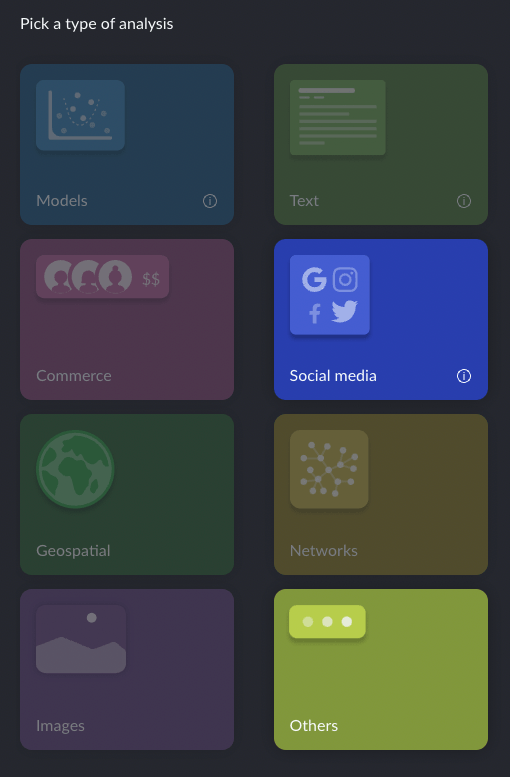
It then opens a panel with two enabled choices “Social media” and “Others” and under Others you find “Enrichments”.
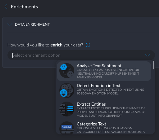
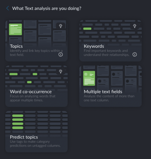
The available enrichment types include sentiment analysis, entity extraction, fuzzy grouping, geolocation, and some external methods that require an API key. Btw, the origins of Graphext were in text analytics, hence all these text analysis options (me likey).
Still, I could not find an intuitive way to add a new variable based on just some data transformations. Hopefully that can be added soon.
Interestingly, while the tool positions itself as a “no-code tool for data scientists”, it does allow you to review the code for the “recipes” (hello Trifacta) that it creates as you transform columns and define models. As such, I see Graphext as a “tool for non-data scientists who want to do data science (but can’t remember the pandas API)”.
IMO, the largest 3 value adds of Graphext are:
– UI guided creation of prediction models
– graph visualizer for the identified clusters
– built-in reporting tool called “Insights”
The tool is still a little buggy and I could not directly create a model (on the Models tab). The “Create model” button was disabled. I found a way to create a model by going to the “Graph” tab. If you don’t see the Models and Graph tabs, hover over the tab bar and click on an icon that looks like an arrow.

On the Graph tab, click on the “Create Network” button.
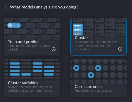
A selection tab will open (remember it from the data “enrichment” step?), with many previously disabled options now being available.
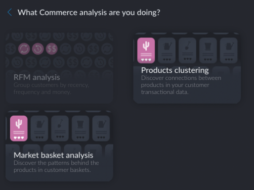
I recommend exploring all of them, because I liked what I saw there. There were training and prediction tasks, text analytics tasks (sentiment and entity extraction), commerce tasks (e.g. product basket analysis)…
Btw, this is where the user experience is still a little rough.
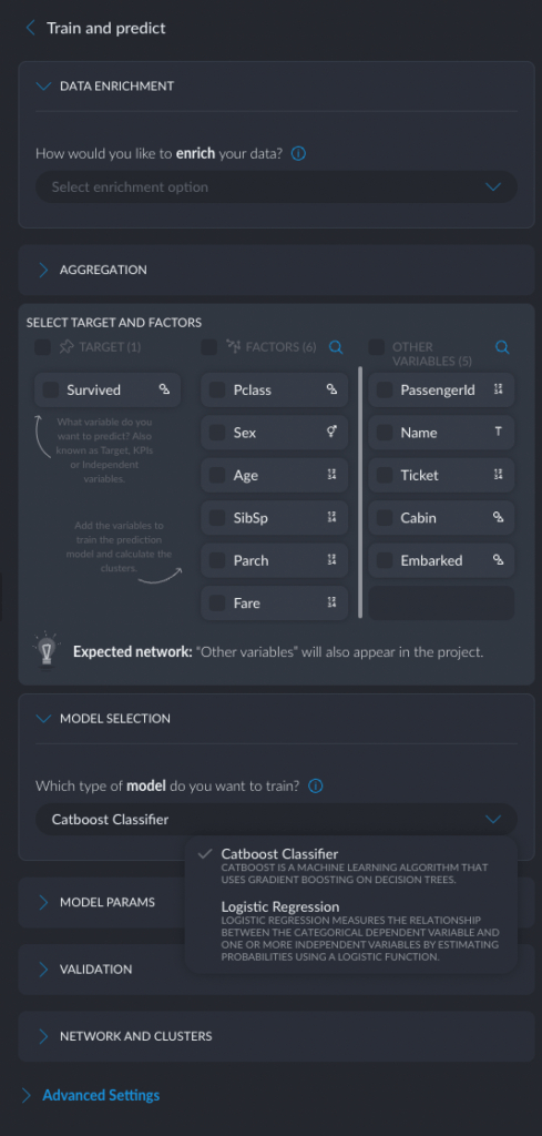
I wanted to create a few screenshots of how to create a clustering-based prediction model. But for the life of me I could not remember what option I chose initially on the selection panel. Was it the “Source and target network”? “Train and predict”? I rolled the dice and chose “Source and target network”, and of course ended up wasting time. I could not even roll back the resulting “recipe” and had to reimport data again.
I tried “Train and predict” and finally found what I was looking for.
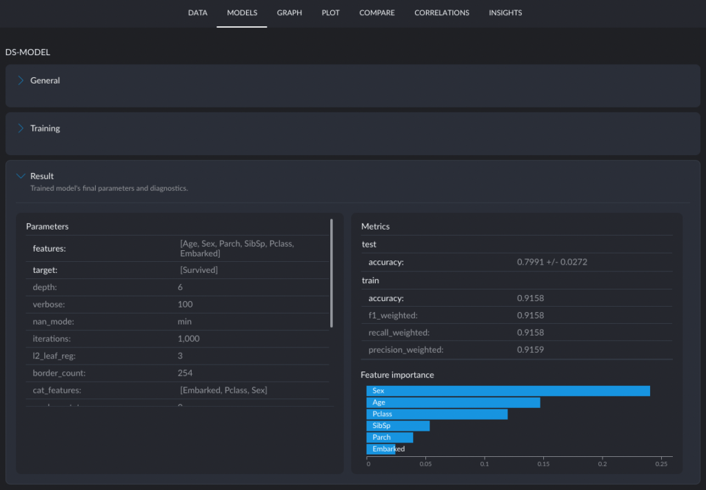
Interestingly, the tool only offered two types of models: Catboost and Logistic Regression (was it because my predicted variable was Categorical?).
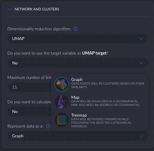
One of the unique (to my knowledge) features of Graphext is the ability to visualize the prediction model as a Graph of Clusters, a Geo Map, or a Treemap. The Graph visualization ended up being very effective in interpreting the results (model explainability).
Training the model took about 5 minutes. Graphext has an interesting architecture. The do the “fast tasks” (render graphs, data transformations etc) in the browser and the “slow tasks” (like model training) in the cloud. The browser takes on quite a bit of tasks, much more than in a traditional BI tool architecture. They even have a data engine in the browser called Durro that is able to render 10 million records as a graph. Durro is based on WebAssembly (aka WASM).
Btw, the resulting model had a 79.9% accuracy on an eval dataset. I liked how the tool highlighted the importance of various features: Sex, Age, Passenger Class. If you know the Titanic story, you will understand.
Graphext does the training on the cloud backend and claims to be able to use GPUs and preemptibles. They mention Apache Arrow as something they use to minimize the overhead on the backend, but are also hinting that their homegrown Durro engine will gradually replace Arrow.
Last but not least, let’s take a look at Graphext’s reporting capabilities. I work a lot with data scientists at Snowflake, and we tag-team on producing reports for our business leaders. We do analyses like root cause, perf and revenue impact of a particular feature launch, drivers of weekly/monthly/quarterly growth or decline. Each activity results in a doc with a narrative and supporting graphs. This is pretty standard for a PM and I’ve done this at AWS, Google and now Snowflake.
The unique thing about Snowflake is that the PMs here have a data scientist buddy who actually does the data analysis for them. They look at statistical significance, correlation-vs-causality, A/B tests and sampling. Fudging favorable conclusions becomes a little harder in this setup. My data scientist buddy likes to work in Jupyter and write code in pandas. A PM like me likes to work in Sheets+Docs. My data analysis tool is Sheets and I write my narratives in Docs (not Slides).
Other functions, based on my own experience, tend to avoid Jupyter. Finance likes Sheets/Excel and can read Docs. Engineering Managers live in Jira, but have to use Docs a lot, because .. reasons. Execs either prefer Docs/Word (if they are from AWS) or decks (if they are from Microsoft), and the Xooglers are still undecided. Sales likes Slack, but let’s set that aside for a moment.
So, this leads to Docs as the least common denominator for communicating insights in a high-tech org.
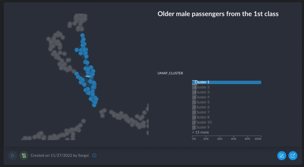
Graphext recognized that the end goal of every analysis (unless you are just grokking the data) is a report that goes to the product, marketers, execs, finance, etc. They’ve added the ability to annotate interesting findings, save them as “insights” and then product a report that is basically a collection of slides showing each individual insight. Here is, for example, one of these sliderized insights – “Older male passengers from the first class had a pretty decent chance of survival”.
While I like it that they thought about the end goal (the insights report), I wish they had an option for me to produce a Doc instead of a PDF deck that I could then edit. These reports go through a bunch of editing and commenting, and I prefer to use the text editor for doing all of that. Dear Graphext, just give me the initial export of the insights into a doc, and allow me to embed your beautiful interactive charts (super important – no static image stuff, please)!
And this brings us to the end of this review. I liked Graphext and can see myself using it for root cause and business driver analysis. They are different from other BI tools out there, and as a techy I liked that they are experimenting with a new deployment architecture (thick client in WebAssembly in the browser and specialized services on the Cloud backend). The UX seems pretty sleek, albeit a bit buggy. I give the tool extra points for offering text analytics features. Nice job!